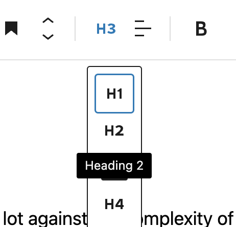
Little things like this are the death-by-a-thousand-paper-cuts stuff that makes the #WordPress block editor so frustrating.
I can't click “H3" because the tooltip for “H2” is covering it.
This UI is FIVE years old now.
And it still winds me up almost every time I use it.
